Craft Show Display Trick – Line & Composition
Line and composition is a visual merchandising technique that is a little more advanced, but will elevate your craft show display.
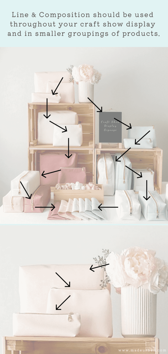
It will help your table or booth feel more balanced and subtly lead the eye from one product to the next.
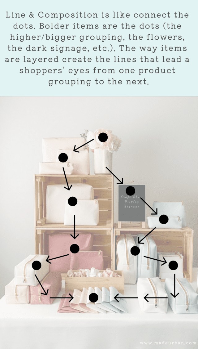
I like to think of line and composition as a visual game of connect the dots.
The lines act as arrows (“look this way”)
While the dots act as stop signs (“stop and look at this”)
A dominant element of your display should grab a shopper’s eye. Then the way your products, fixtures, and props are set up will draw visual lines that draw the eye to the next (less dominant) focal point.
Here’s how to apply it to your craft show display.
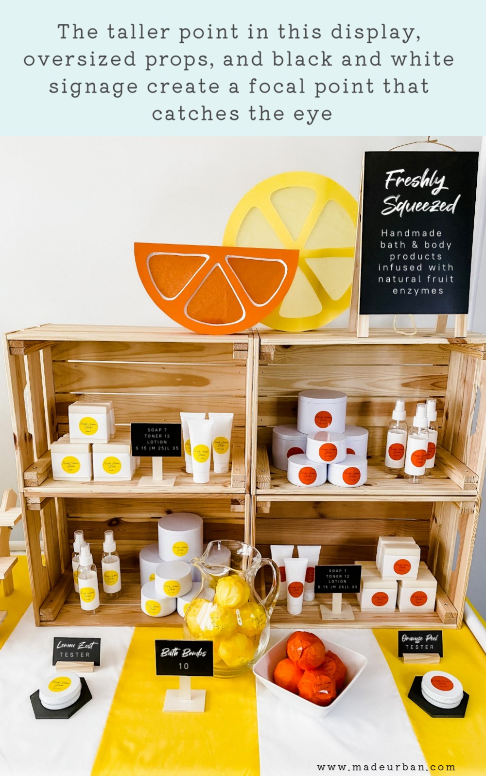
Step 1 – Choose your focal point
Consider the layout of your table or booth (as explained in this article) and which side of it you want to draw shoppers in.
Then determine which product or brand element is typically the most attractive/eye-catching/interesting to shoppers.
It doesn’t necessarily need to be your best seller. It might be an item that doesn’t sell very often, but always grabs attention.
I had a bag like this. It was actually a knitted bag (a chunky cable knit pattern) with handmade wood handles. Almost every shopper looked at it, picked it up, said how much they liked it, but it never sold (due to the higher price point).
It could also be your logo, a photo, a prop, or a unique selling point that grabs shoppers’ attention (e.g. “Soap You Can Eat”) and is communicated through a sign.
This showstopper should go in your “zone 1” and be displayed in a way that helps it stand out and grab attention.
It may be:
- a bigger composition (e.g. displaying 3 of the same bag to make a bigger and bolder statement)
- taller display (use taller fixtures to raise that part of your display to the highest (but still safe) point)
- brighter color (bolder colours can help catch the eye)
- props (you can use props, photos, or signage to help make a statement)
- etc.
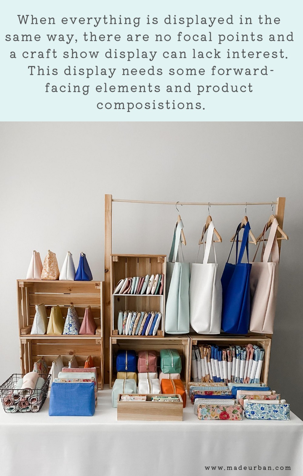
Step 2 – Add variation
When determining how to stock and display your other products, be sure to add variation.
If you think about a thrift store or off-price department stores, such as Marshalls or Winners, the clothing is all side-hung on clothing racks. So nothing stands out.
When you think about clothing boutiques, clothes are:
- side-hung
- hung forward facing
- folded in stacks
- laid flat on a table
- shown on bust forms
- shown in photographs
- etc.
This variation creates interest that gets shoppers to stop and take things in (because the patterns created by the products are less predictable).
The variation also allows you to create different lines and compositions that act as arrows and stop signs.
Consider the different ways you can stock and display your products.
>> Here’s the difference between stocking a product and displaying it: Craft Show Display 5 Minute Fix: Display vs. Stock
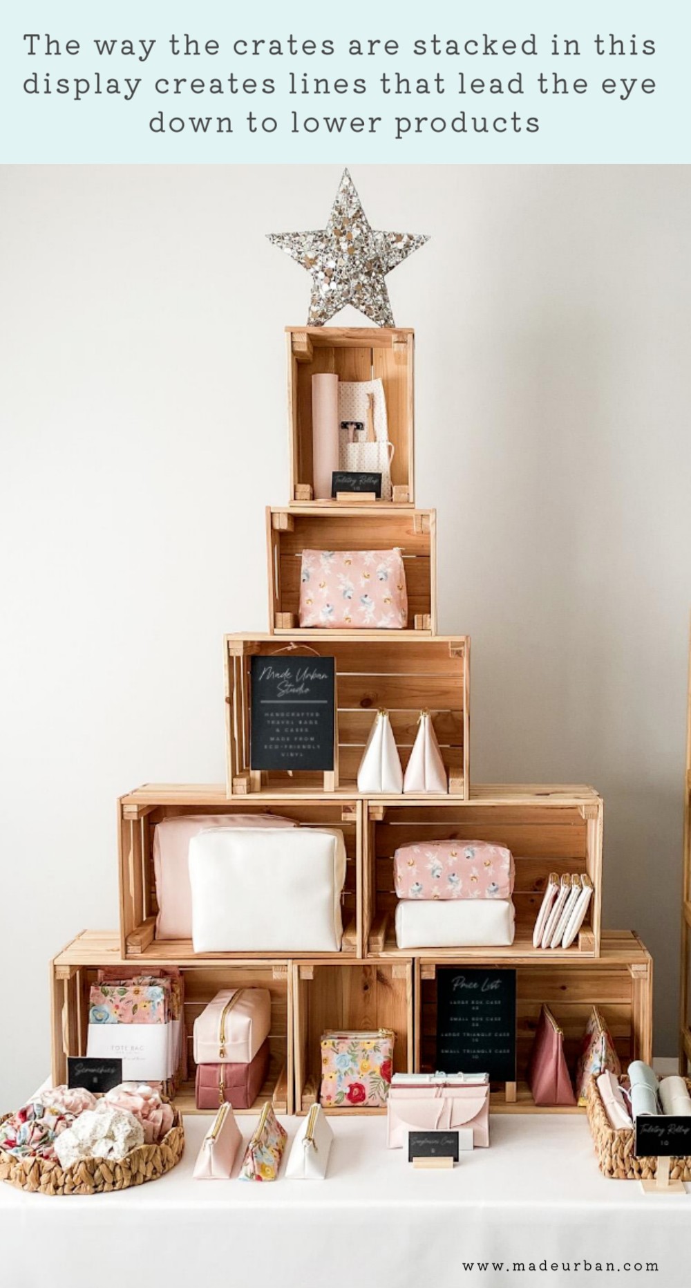
Step 3 – Create arrows
Think of lines as directional arrows. They point or guide shoppers where to look next.
They’re not literal lines, but rather a string of objects that tie one object or grouping of products to the next.
A line can be created by
- the way products are overlapped in a grouping
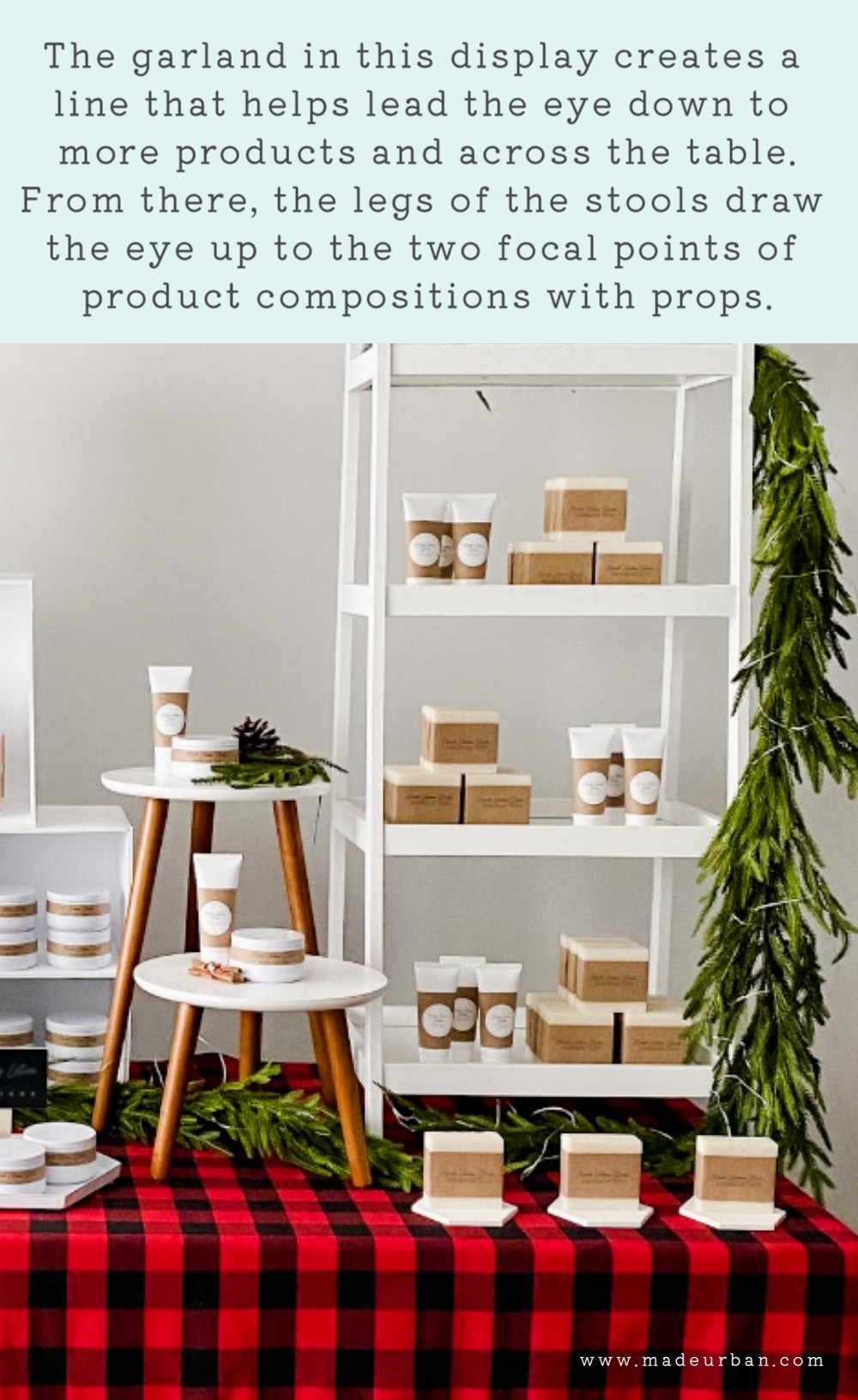
- A prop (e.g. a garland draped down a fixture can create a line)
- the way fixtures are set up (crates stacked in a pyramid pattern will naturally catch the eye at the top and lead it down)
The nice thing is…there are no rules.
Simply stand back (I also find it helps if you squint your eyes…check out why I use this odd trick here) and consider whether or not each element of your display flows to the next.
Step 4 – Create stop signs
Just as you chose an element/product to be the focal point of your display, you must also choose which other products/elements you want to get a (smaller) spotlight.
For some products to be the focal point, others must be less dominant.
If everything is a bright flashing light, nothing stands out.
So choose your favourites (ideally your bestsellers) and determine how you will make them stand out more in your display.
It should be a balance of focal point, visual break, focal point, visual break, throughout your space.
That might be:
- Focal point – product displayed with props
- Visual break – products stocked sideways
- Focal point – a grouping of products forward-facing
- Visual break – a stack of products folded
- Etc.
Step 5 – Make room for negative space
The other key to creating lines and compositions is that there has to be room to do so.
If every item is crunched into a space, everything blends into each other, which becomes visually overwhelming.
Try to leave a couple of inches between each element.
Here’s more information on the importance of negative space and how it can help make your products seem more expensive: Craft Show Display 5-Minute Fix: Add Negative Space

Hey, I’m Erin 🙂 I write about small business and craft show techniques I’ve learned from being a small business owner for almost 2 decades, selling at dozens of craft shows, and earning a diploma in Visual Communication Design. I hope you find my advice helpful!