6 Simple Ways to Improve a Craft Show Display
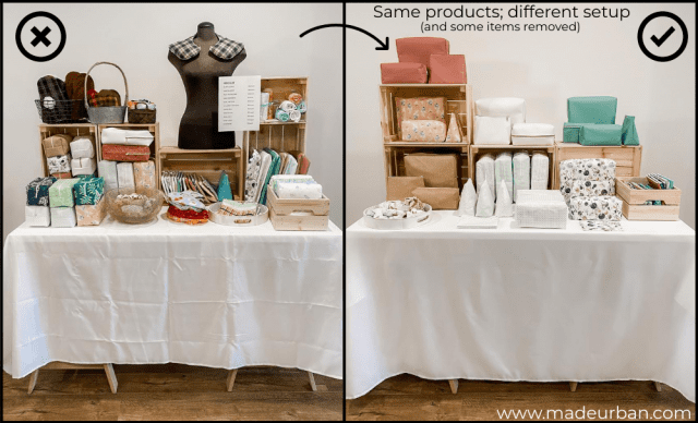
To share the lessons in this article, I’ve replicated a craft show display I saw online that I thought could use some improvement, and have explained what I would change and how.
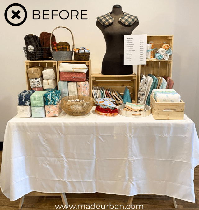
Does the “before” display work?
Yes.
Could it use some improvement?
Also, yes.
I chose this display to replicate because it illustrates the most common mistake I see with craft show displays:
>> COMMON MISTAKE: Trying to fill every bit of space and creating a stockroom rather than a display.
But that’s not the only mistake I’d like to point out in the before picture.
Below are 6 mistakes I would correct (can you determine what they are before reading on?).
As well as the steps I took to improve the display.
Important Note
Nothing new is added to the “after” display; I used the same products and display fixtures shown in the before picture.
This display was improved through subtraction (removing items; not adding).
It’s also important to note, the after picture doesn’t incorporate other important display techniques I share on Made Urban (such as using props to tell a story or incorporating these 3 advanced techniques).
This is because I want to demonstrate how a display can be improved with very little effort and no added expense.
These are lessons you can apply while you’re at a craft show.
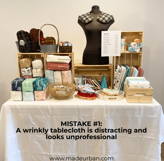
Mistake #1: Wrinkly tablecloth
I remember seeing another vendor ironing their tablecloth at my very first craft show (yes, they actually brought an iron and ironing board).
I looked at my disheveled table cover and immediately felt embarrassed. But it showed me the difference a polished and on-brand tablecloth can make.
No detail is too small.
Something as small as a wrinkly tablecloth can throw off your display.
It looks messy and unprofessional, and it distracts from your products.
Simple ways to avoid a wrinkly tablecloth are:
- Choose a tablecloth in a fabric that doesn’t wrinkle easily (e.g. polyester). Also be sure to choose a color that works with your brand and products (neutrals are always safe).
- Iron or steam your tablecloth at home and then store it in a way that doesn’t cause creases during transport (e.g. you may roll the tablecloth around a pool noodle, or fold it and make sure it’s stored on top of your stock; not at the bottom of a pile.
- Bring a spray bottle so you can mist your tablecloth with water and smooth out wrinkles.
- You may even invest in a handheld steamer (like this one). A steamer will be beneficial if your products look better after a quick steam (e.g. some of my bags get wrinkled after being folded down, but would require too much space to keep them stuffed for transport. A quick steam at the craft show would make them look more polished).
Mistake #2: A price list
Unless you have a limited product line and a minimalistic display that makes it easy for shoppers to determine the names of your products, you should use individual price signs or price tags on each item.
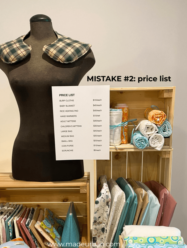
Using a price list, such as the one shown in the before display isn’t ideal for shoppers.
Here’s why:
- customers don’t know your products – it may be obvious to me which item is a “large bag” and which is a “small bag” but a shopper would need some time to study my products to figure out their names.
- you’re making shoppers work – figuring out prices shouldn’t be a puzzle; keep things simple for shoppers.
- it can be missed – a shopper at one end of the table may miss the price list on the other end of the table. Asking “How much for this?” doesn’t seem like a big deal, but if you tell them a price and they put the item back down, it gives the impression that either they don’t think the item is worth that price, or that they can’t afford it. Two things most shoppers don’t want others thinking.
Many shoppers will simply choose not to buy if they can’t subtly determine the price.
Instead of a long price list, I would opt for price tags on each item.
This ensures there’s no confusion with prices.
Small signs can be useful too. But if a shopper places an item next to the wrong price sign, other shoppers may think that item is more or less expensive than it is. Which is why price tags are ideal.
Price tags on each item and minimal use of table signs will avoid confusion and keep your space uncluttered.
Mistake #3: Stacks of product
If you want to make sales, you need shoppers to interact with your items; touch, test, examine, etc.
When products are piled high, crunched into your space, or sitting on display fixtures that look like they might tip over, shoppers don’t want to pick things up.
I would be a little nervous to touch a stacked bag out of fear things might fall over. And it looks like too much work to get to a bag at the bottom of the pile (it’s like a game of Jenga).
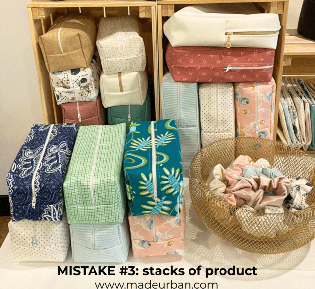
On the other hand, if your display looks too perfect, it may also deter shoppers from touching products.
Make your display shoppable and inviting for shoppers to touch.
Some products look more precious than others. In this case, use signage “Please, pick me up!”, or “Feel how soft I am”, or “Don’t be shy, test me out”.
You can also lead by example.
Pick products up, pass them to shoppers, and encourage them to touch (e.g. “Feel how soft this item is” or “I love the smell of this soap”).
Mistake # 4: No negative space
Negative space, or blank space, allows shoppers to take in your products without getting overwhelmed.
It’s not like an overstuffed display is going to make shoppers’ heads spin. But when one product runs into the next, it doesn’t give shoppers a chance to take in each product’s story.
If I’m selling baby products, I want shoppers to imagine cuddling a baby with my cute, soft, and cozy blankets.
Having those baby blankets folded up and mixed in with cosmetic bags and scrunchies doesn’t give shoppers an opportunity to get the message or feel the emotions those products should evoke.
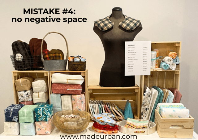
Negative space in a display is like smelling coffee beans between fragrances; it “cleanses the palette”.
An overstuffed table also doesn’t give shoppers a place to set down their purse/wallet when browsing your products or making a purchase.
Give your products, and your shoppers, some breathing room within your display.
Mistake #5: No flow
A display should lead shoppers’ eyes around your space.
A large, tall, or bright-colored item can catch the eye.
The eye-catching element should correlate with the flow of traffic. If the majority of shoppers will approach your table from the left side, the eye-catching element should be on the left side to draw them in at the start of your space.
From that eye-catching element, products, props, and fixtures should then create a game of connect-the-dots, so shoppers’ eyes flow through your space.
In this display, the high point (the bust form) is in the middle. Then your eye is drawn to the price list (not an element I want to highlight).
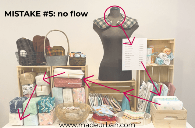
Because the space is treated as a stock room and not a display space, there isn’t another element that causes you to pause. The eye is naturally drawn to brighter, bigger, or bolder objects and wants to dart around the space; skipping important products.
You should intentionally create “stop lights” in your display to get shoppers to pay attention to certain products, and not skip over any.
This type of setup also doesn’t allow for interaction with shoppers. There isn’t a great opening where I can reach out from behind the table and point to or pick up products, or easily interact with customers (e.g have conversations, take money, pass them shopping bags, etc.).
A display should have zones that help customers flow through the space (even when it’s a small 5-foot table). Here’s more on zones: Craft Show Table Layout Tips
Mistake #6: No repetition or cohesion
A craft show display needs repetition. That repetition helps creates cohesion (i.e. unity among all the elements in your display).
This display is showcasing:
- mittens
- hand warmers
- heating bags
- burp cloths
- baby blankets
- large/medium/small/x-small cosmetic bags
- scrunchies
There isn’t a common theme among those products.
The display fixtures are a mix of:
- wooden crates
- a wicker basket
- a metal basket
- a black wire basket
- a gold metal bowl
- a white wood tray
There also isn’t a common theme among the fixtures.
Repetition and cohesion should be in the form of:
- materials/ingredients – repeating a scent, color, or pattern among several products.
- shapes – for example, squares or rectangles repeated in bag designs or display props.
- color – using one color in several products, display fixtures, elements (e.g. signage, tablecloth), and props.
- types of products – repeating a product (e.g. bags) sends a clear message to shoppers. Whereas too many products (e.g. bags, burp cloths, baby blankets, heating pads, mittens, etc.) don’t create a connection between all my products, nor does it clearly tell shoppers what I sell and who it’s for.
>> For more craft show display tips, join my free email challenge: 5 DAYS TO A STANDOUT CRAFT SHOW DISPLAY
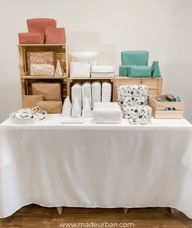
6 Steps to improve the display
For the “after” display, I did not add anything.
These are the same products and fixtures.
I simply edited and removed what wasn’t necessary.
STEP 1: Remove
The majority of craft show displays I see have too much going on.
Editing out products, props, and fixtures that muddy your message, confuse shoppers, and/or target different people can make a big difference.
For example, my shoppers may wonder what hand warmers have to do with cosmetic bags. You wouldn’t use the items together, or gift them together; they’re not two products that would commonly be purchased together.
“Lower-quality” products can also create confusion when mixed in with high-end/high-priced products.
Imagine plastic jewelry displayed next to diamond jewelry; the plastic will cheapen the diamonds and make shoppers wonder if the diamonds are even real.
Remove products that don’t make sense together, aren’t for the same target market, and/or aren’t on-brand.
In this example, the bulk of my inventory is bags.
Mittens, heating pads, and baby items don’t make much sense with cosmetic bags. So I’ll start by removing those items.
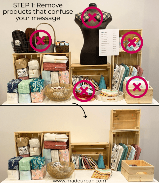
*You’ll see in the second after picture at the end of this article, I do have room for another small crate on my table, which I can use for a small sampling of the other products I removed from my display (if I really felt they were important).
In this case, I do feel baby products, mittens, and heating bags confuse my message. Rather than displaying them on my table, I would be sure to chat with shoppers and uncover what they’re interested in. If I got the sense they were shopping for baby products/mittens/heating pads, I would simply say “I do have a few other items behind my table if you’re interested in ______”.
I’ll also remove display fixtures that don’t work well with the wooden crates. That would be the wire basket, metal basket, wicker basket, and gold metal bowl.
I’m left with wood crates and a wood tray; a wood theme.
*For the next craft show, I would consider painting the wood crates white. That would allow the products to be the focus and the crates to blend into the background and with the tablecloth.
And lastly, I’ll remove the wrinkles from my tablecloth 🙂
STEP 2: Hide
In order for some products to be the focus, others can’t be.
You don’t want everything competing for attention.
When left with just bags, there are still items that don’t mesh well in the space and would look better in my “stock area” (a crate/box on my table).
Decide which products should get most of the attention, and which should be in the background of your display.
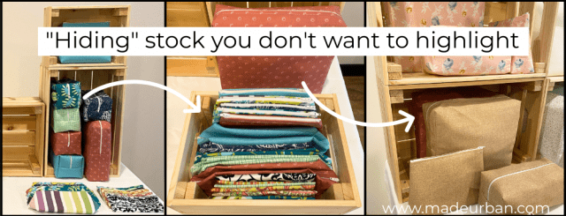
When I say “hide”, I mean displayed in a way that doesn’t draw attention to the products.
In my example display, I’m “hiding” products in a wooden crate on my table.
Shoppers can still see and shop the products, but they’re a little more tucked away; making room for the items I want to highlight.
You may choose which items to highlight vs. hide based on:
- color – which colors look good together, are on trend, or will catch the eye?
- shape – do several products have the same shape? Repetition in shape can catch the eye, so you may choose to highlight products with a similar shape and hide ones that don’t fit that shape.
- displayability – some products may display better than others and won’t fall over or get lost in the space.
- purpose – which items make sense together and would be purchased together?
- popularity – which items are your bestsellers?
- price and/or profit – which products will help you make the most money?
I’ll start by sorting my products by color to decide which to highlight and which to hide.
I find that color is the best way to make an impact, tell a story, create cohesion, and sort your display.
I have a lot of items in softer colors: white, gold, pink, and blue. And then I have several items that use bolder/darker colors: turquoise, teal, navy, black, etc.
The lighter colors all mesh well together. And there are enough of them to create a full display.
On the other hand, the darker, brighter colors have less cohesion among them and I don’t have as much inventory in them. These are the items I will tuck away in my stock area.
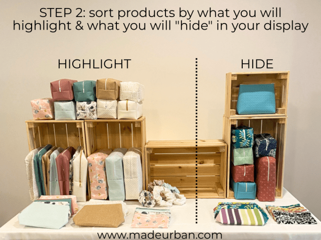
As you can see, taking the stuffing out and folding these items allows me to place most of them all in a crate/box that shoppers can thumb through. I can also tuck bags behind the ones I do want to highlight.
STEP 3: Group
Now that I’ve decided on the stock I want to highlight, I can create groupings.
My groupings will combine products and colors that work well together.
I don’t have a lot of space to work with and can probably only fit 3 groupings on this table.
To determine groupings I play with combining colors and patterns until I find combinations I like.
My groupings could be:
- white and gold
- blues
- pinks
OR
- whites
- pinks and gold
- blues
OR
- dark blue, dark pink, and gold
- light pink and blue
- whites
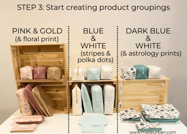
Set products together and then stand back and assess how the items look together.
Look for balance and make sure the products in a group complement each other.
You don’t want one grouping to look too heavy or dark or full, or the colors within a grouping to clash.
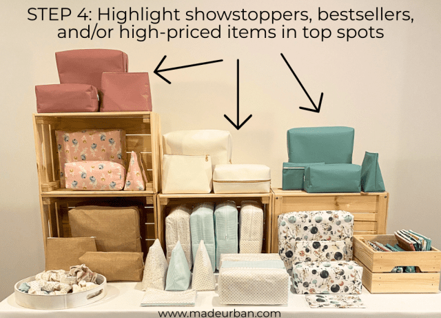
STEP 4: Highlight
Now I need to determine which products to highlight in the highest points of my display.
These items should be show-stoppers (items shoppers always “oooh” and “ahhh” over), or higher price point items.
My vinyl bags are more expensive than my cotton bags, so I decide to display those at the top of my display.
STEP 5: Create vignettes
Your products should be displayed in a way that helps shoppers understand your vision or how your products might be used, and encourages people to buy more than one item.
Not only does this create a stronger message, but it will also increase your revenue.
Instead of showing all my large cosmetic bags together in one section, then my medium bags in another section, and small bags in another, I combine them in smaller groupings to help shoppers see that they make a great makeup bag set.
STEP 6: Repeat
Repeating the groupings throughout the display creates cohesion (which is more visually pleasing, and shoppers are drawn to visually pleasing spaces).
The other benefit of creating these smaller groupings is that people can see and shop every one of your products, no matter which side of the table they’re on.
If all my large cosmetic bags are on the left side of the table, at a busy craft show, shoppers will have to wait until the left side of the table is clear to browse large bags.
Having my large, medium, and small cosmetic bags displayed on the left, middle, and right of the display allows shoppers to view them no matter which side of the table they’re stuck on.
Options
There are many ways to play with this display, and I could add a few more of my “hide” products by adding another small crate to the table.
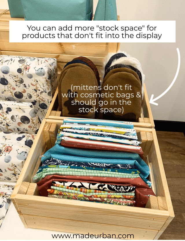
For example, if I add just 3 mittens to that second crate, I could fit a heating pad and even some burp cloths. Then I could pull options from behind my table when someone is looking at an item in the “stock area”.
I understand vendors’ hesitation to remove stock.
I was nervous at first to reduce my selection of products.
My first few craft shows started with:
- pillows
- pajamas
- heating bags
- photography and cards
- aprons
- a wide assortment of bags
- and more
But I really did see an increase in sales, as well as opportunities (e.g. store owners asking to carry my products) as I refined my selection and only focused on bags (and then just 3 types of bags).
You can test this by using 3/4 of your table for displaying products that work together and send a strong message (e.g. cosmetic bags, or jewelry, or winter accessories). And use the other 1/4 of your space to “store” products that don’t fit.
This is also a good way to determine which of your products draw in more shoppers and help you make more sales.
For example, I could test showcasing my bags on one day of a craft show and then switch and showcase my baby products on the second day.
If I attracted more shoppers and made more sales when showcasing baby products, it may be an indication that I should focus on baby products moving forward and phase out cosmetic bags (although, I would test that at a few more craft shows before making a big change).
I hope you found this article helpful! Please share if you would make any other improvements to the after display 🙂

Hey, I’m Erin 🙂 I write about small business and craft show techniques I’ve learned from being a small business owner for almost 2 decades, selling at dozens of craft shows, and earning a diploma in Visual Communication Design. I hope you find my advice helpful!
This is great. Thank you. The final result is just fabulous. I remember the first time I exhibited at a gift fair. After setting up I walked around and looked at other setups. Frankly, I could have cried, ours looked like a stock room!! The next show I went to I used a professional to help with the layout and we got orders from bigger buyers because our setup was cohesive.
This is great advice!!!
I was in the same boat at my first craft fair 😉 A cohesive display really does impact sales hey? Thanks for reading and commenting!
~Erin
Thank you! Many crafters need some help with merchandising, and these are all principles I use in my resale booths. Details matter….
Thanks for reading Mary! Glad to hear you agree with my merchandising techniques 🙂
~Erin
Yes very helpful with seeing the before and after pictures, and yes it is hard to remove products from your table. After all, craft show fees have risen and you are trying to take advantage of the space you are given. Looking forward to more articles from you.
Thanks Mary! I’m glad the photos are helpful. It was fun to work on them 🙂 I completely understand, it is scary to take away. I think testing it out and creating a stock area on your table is the best way to dip your toes in and see if the refined selection resonates with your target market.
~Erin
I would add that the stall has no branding – nobody knows who is selling the products on display.
A well-designed sign pinned to the front of the tablecloth and a small display of business cards (as well as any other signage / price tickets in matching branding) would mean that people get to see the name of the business behind the products – and take a card if they like what they see, but aren’t able or willing to purchase on the day. It helps if business cards include website and social media details, so they can look you up later.
Great point Sharon! The “after” display doesn’t include branding because I wanted to show how to work with what you have while you’re at a craft show. But absolutely. Branding, props, marketing materials, and a few other techniques should be implemented when you have the opportunity.
~Erin
Excellent advice Erin. Even for those of us that have been showing for years. I look forward to each email you send. I sell jewelry, where display is everything. The tips still work. Thank you for your generosity.
Thank you Julie! I’m so happy to hear my advice is still useful to someone who’s been in the game for years 🙂
~Erin
Thank you for this! Your articles are always very helpful. I have a problem with too much stock. This helps me tremendously!
I’m so happy it’s helpful Kim! Let me know how it goes as you refine your stock 🙂
~Erin
Hi,
I totally appreciate your tips and I’ve found myself utilizing many of them in my display.
My question. Is what if you sell lots of little things. For instance, I am a paper crafter. So I’m selling greeting cards, photo albums, journals, and stuff like that. How do I display things in that situation?
Thank you!
Hi Chris! I would follow the same 6 steps but your groupings would be paper products customers commonly purchase together. For example, maybe photo albums and journals are commonly purchased together as birthday gifts. Choose journals and albums and birthday cards that follow the same theme (e.g. same type of paper, similar colors, etc.) to create your groupings and plant the seed that they make great gifts and should be purchased together.
You may choose to only use the top spaces of your display to create “vignettes”. Then you can stock journals below one vignette, albums below another vignette, and cards below another.
I hope that helps!
Erin
Great tips and display strategies. Thanks for sharing would love to see more posts like (a series perhaps) using different types of products.
Thanks Anitra!
What a great article! Hope there will be more like this – and I’ll be the first to volunteer for a makeover! I have two things I focus on – stuff for the moms (Marimekko tote bags, Kaffe Fassett aprons, and potholders) and stuff for the kids (stuffed animals with clothes). I don’t want to give up either of them, but it does seem like I offer too much. This article really has me wondering!
I’m so glad you enjoyed it! You may consider “testing” a more limited selection by using one end of your display for products that aren’t commonly purchased together. Aprons and potholders (and other kitchen items) are good complimenting products, but if bags tend to be your moneymakers, they may make up the majority of your display while aprons and potholders go in the “stock area”. It took a lot of testing for me to find what sold best but with each event, my path became more clear. Let sales guide you 🙂
~Erin
Your advice is much appreciated!
No problem! Be sure to let me know how it goes 🙂
~Erin
As usual, great tips! The steamer that you recommend – I couldn’t get the link to work. Not sure if the problem is on my end.
Glad they are helpful! It links to a Conair handheld steamer. But here are several options: https://www.amazon.com/s?k=handheld+steamer&crid=DIKTN0N2LGR8&sprefix=handheld+steamer%2Caps%2C336&ref=nb_sb_noss_1
Hopefully that link works 🙂 If not, you can Google “handheld steamers” and find some options.
Erin
It worked. Thank you!
Really great thoughtful article. Lots of amazing takeaways here! Thanks for sharing!!
Another great article! Thanks for all of your tips, tricks, insights and helpful posts. Having a photo is also a great help to “visualize” the information you provide. I learn from and love all of your articles. Thanks!
Thank you Jennifer and Terri! I’m so glad it was helpful 🙂
Erin
The tablecloth as a marketing tool and link to VistaPrint is very helpful.