How to Use Color at a Craft Show to Attract Shoppers
If you want a craft show display that stands out, you must strategically use color. Color is what catches the eye, evokes an emotion within seconds, can help tell a story, and much more.
Using color effectively so your craft show display catches shoppers’ eyes is fairly easy, but it does take some thought. Here are my tips:
Choosing Colors
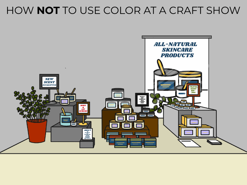
Colors used in your craft show display should not be chosen randomly.
At my first craft show, I gathered a moss green jacquard patterned tablecloth, wicker baskets, bowls for smaller items, and clear acrylic frames from the dollar store.
Not really a fit for the colorful flannel pajamas and other random items I was selling.
First of all, I was offering way too much selection (you can find out if you are too by checking out this article). Secondly, there was no cohesion in my display.
You may base your display colors on:
- Brand
- Product Collections
- A feeling/mood/vibe
- A theme
- A season/holiday
- Etc.
1 – Based on Brand
Your brand is a good place to start because your logo was likely professionally designed and will have a professional-looking color combination.
Pulling a color or two from your brand colors works best when your products feature similar or complementary colors.
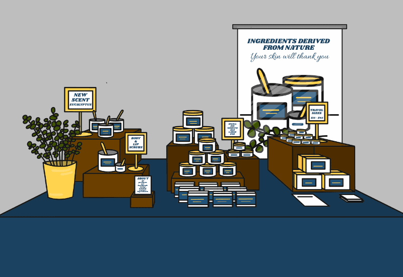
For example, a bath & body vendor may switch up scents throughout the year but always keep their packaging and labels the same, which feature brand colors (let’s say blue, white, and gold). They could really make their space pop by pulling blue throughout the display with accents of white and gold.
A display without a color scheme doesn’t have the same pop and can look messy and unprofessional.
Avoid pulling your brand colors into your display if your products are colorful and might clash.
For example, if your brand colors are soft purple and gold and you’re featuring a fall collection with products in deep rich colors, having soft purple throughout your display may clash with your products and throw off the fall feeling you want your products to evoke.
If you haven’t developed a brand yet, and don’t have a set brand color palette, consider the vibe or feeling you want your brand/business/products to evoke.
>> Do you want people to feel calm or excited when shopping with you or using your products? Yellow gives off a vibrant, cheerful, or playful vibe (depending on the props/products it’s paired with).
>> Do you want your business/products to give off a masculine or feminine vibe? Pinks, reds, or soft colors can have a feminine feel.
Choose one or two words to describe how you want your shoppers/customers to feel and then choose a color that best represents that.
2 – Based on Product Collections
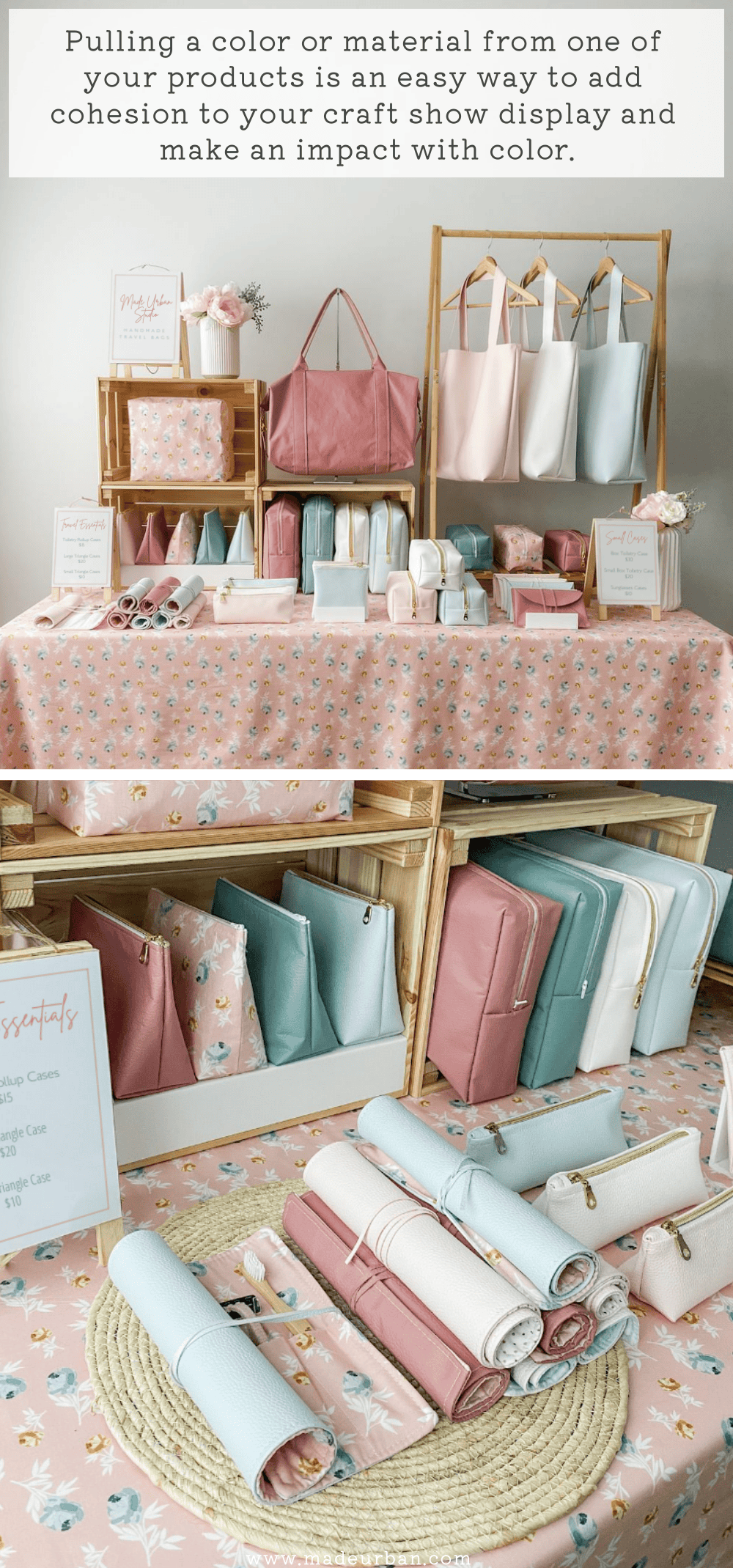
If your products change throughout the year and collections are color-based, pulling a color or two from the collection you’re featuring at the craft show may be more impactful than using a brand color throughout your display.
In the example below, the material used for a few bags is also used as the tablecloth. Pink is also pulled into the signage and props (pink flowers).
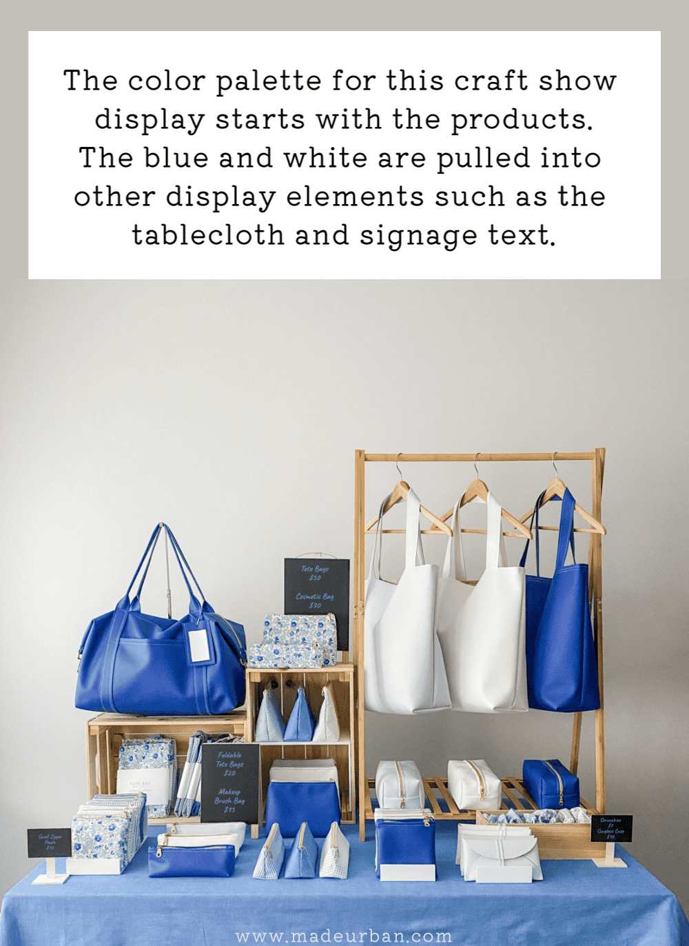
Here’s an example of a blue and white product collection. Blue is repeated throughout the products, as well as in the tablecloth and signage text.
If you are displaying more than one collection on your table, you may choose to use:
- A neutral color in display elements; one that compliments each collection
- One color that is present in each collection or compliments each collection
When featuring collections you want your display elements to compliment them so each collection can tell its story.
3 – Based on a Feeling
You may also choose a color based on the feeling you want to evoke. How do you want customers to feel when they look at your display, or even when they get your products home and put them to use?
Let’s say your brand colors are neutral and your product colors don’t change much throughout the year. You may want to evoke the feeling of happiness and use bright yellow throughout your display. Or choose soft blue to evoke a calming feeling.
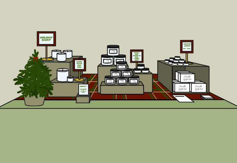
For example, a business selling candles may keep their wax color white, candle jars clear glass, and packaging black & white, year-round.
But they want to keep their display looking fresh and coordinate with the season or holiday.
In this case, they would think about the feeling they want to evoke or the story they want to tell, through color.
(I share how to determine a story with your display in the free 5-day email course)
Let’s say they’re selling at a Christmas craft show. They may add red and green throughout their display, or go with a more elegant, modern Christmas vibe using navy and touches of silver or gold.
For fall they may swap out the green and red elements for rich orange and deep brown.
Spring may inspire soft pastels or vibrant yellow.
Think about the feeling you’d like to evoke or the story you’d like to tell and research colors to help you do that.
How to Use Color to Grab Attention
Color can be used in display elements, such as the tablecloth, fixtures, props, signage, and even your attire.
Because these elements tend to be bigger components of a display, using color strategically for each will naturally catch a shopper’s eye.
If the color in your display comes from your products, be sure they make a statement.
It can be hard to notice smaller items, such as jewelry, from across the room. So instead of relying on an individual piece to make a statement, you can group items featuring the same color, to make a statement. Sort of how one person wearing red in a crowd wouldn’t catch your eye as much as 10 people wearing red standing together would.
Or, let’s say the elements of a display are white so colorful pieces of pottery can stand out. To ensure they’re noticed from across the room, a photo of the vendor’s bestselling piece may be enlarged and displayed behind and above where the vendor stands.
Or better yet, if the vendor space allowed for hanging, they could have 3 images at the same level (repetition is another standout display element; read more about using it here).
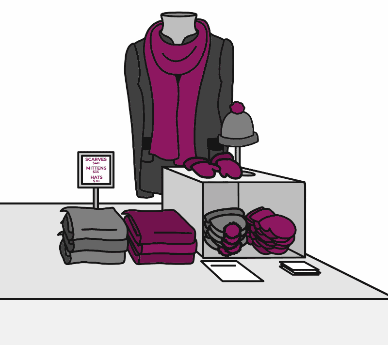
If the items were larger (e.g. colorful scarves), a display fixture at eye level or higher could feature a popular color. That may be a bustform sitting on top of the table, wearing a winter jacket (because people wear winter scarves with jackets…not t-shirts or nothing at all;) with a colorful scarf wrapped around the neck.
Ensure that your use of color is bold enough and placed high enough that it can be noticed from across the room.
How Many Colors to Use
The key to using color to grab attention and make your craft show display stand out is to keep your colors limited.
Generally, the fewer colors used, the more of an impact you’ll make.
My advice is to feature no more than 3 colors.
Of course, there may be more than 3 colors within your display, but only 3 or less should be dominant and repeated throughout.
For example, a vendor may focus on soft pink, purple, and green for a spring vibe, and repeat those colors in products and display elements. They may still have touches of silver found in sign frames, white used for risers, or black used in signage text, but not enough of those colors to compete with the pink, purple, and green color scheme; rather just compliment it and blend into the background.
Lack of color can make a big impact too.
Someone selling white candles, or silver and rhinestone jewelry, or white wedding accessories, or black and white photos could use white throughout their display. Nothing in particular jumps out and grabs your eye but the display as a whole makes an impact.
And if you have a good eye for visual design, an abundance of color can also make a bold statement. This requires some strategy to ensure a display doesn’t end up looking messy and disjointed.
Best Tablecloth Color for a Craft Show
The best color for a craft show tablecloth is a neutral, such as white, black, grey, or shade of brown. Choosing a neutral color will allow your products to stand out.
When signing up for your first craft show, it’s likely you haven’t developed your brand yet and perhaps don’t have product collections sorted. In this scenario, a neutral tablecloth color that compliments your products is best.
For example, if I’m selling reusable food wraps, a beige may be the best neutral color since it has an earthy feel to it, which aligns with my earth-friendly products.
On the other hand, if I’m selling jewelry that incorporates colorful gems, a white tablecloth might work best to keep a clean background so the bright colors can stand out.
Once you develop a strong brand and/or product collections, you may want to personalize your craft show tablecloth more so your entire display makes a bold statement.
For ideas on the different elements of your display you can incorporate color to make an impact, please check out MAKE MORE MONEY AT CRAFT FAIRS.

Hey, I’m Erin 🙂 I write about small business and craft show techniques I’ve learned from being a small business owner for almost 2 decades, selling at dozens of craft shows, and earning a diploma in Visual Communication Design. I hope you find my advice helpful!
Hi! How important is it to raise your table? I’m asking because I’m only 5″, and my display is about 2″ tall (I have ring boxes on the table, and some 2″ wire grids where I hang my earrings and necklaces) and when I raised my table, I wasn’t able to see over my display. (I had to peek in between sections like a big weirdo 🙂
I’ve thought of raising the table and getting a step to stand on behind it, but we don’t have a lot of room (I share the booth with a VERY tall woman) and I think we’d kill ourselves tripping on the step.
So, how important is the ‘raising of the table’?
Hey Rachell,
Thanks for reading! I wouldn’t say you need to raise the entire table, just sections of your display, such as your zone 1. This article and the images in it may help: /blog/craft-show-table-layout-tips/
It’s important to display your products at varying levels because it helps catch shoppers’ attention and allow them to view more products at a glance, gives you more space to display products and it makes it easier for people to shop.
If you just raise a section, it will add height to your display but allow room on either side to interact with shoppers.
Hope that helps!
Erin
I didn’t realized until after posting that this was the wrong article to post my question to — thank you so much for responding and answering my question!!!! (Sometimes, you don’t even know there’s a problem until you’re in the midst of a show! 🙂
No worries, I still understood your question 😉 And no problem, I hope my response helped!
Erin
Thanks for a great article! I am an enamel jewelry artist, so my products are full of color. I use black, wood and white to tie everything together. Just wanted to toss this out as an idea for people who make very colorful products that speak for themselves.
Hey Chris,
Glad you enjoyed it! Those sound like the perfect background colors to allow your jewelry to stand out. Thanks for sharing!
Erin
Could you give me ideas on how to sell my artwork paintings? I don’t have a clue how to set up my booth using Colour and design. I attach my paintings to wire grid panels and they just won’t sell! I have landscape paintings, flower paintings, bird paintings all in different colours and mediums…mainly acrylic, oils and watercolour and my prices are low, so I don’t know what I’m doing wrong.
Hi Michelle,
There may be a few things that are causing a lack of sales. One may be your low prices; they may be sending the wrong message to shoppers. Handmade products and original pieces of art are supposed to cost more than mass-produced products. So if craft show shoppers see paintings in other vendor’s booths that are double or triple the price of yours, they may question the quality or authenticity of your work.
You may also need to find a niche in terms of what type of paintings you focus on so you can become an expert in one (e.g. focus on acrylic or oils or watercolor, but not all) as well as the subject you paint (e.g. become known for your detailed bird paintings or your landscape paintings of popular travel spots but not both).
Try to find a particular customer you want to sell to and then create paintings based on their preferences.
I hope that helps!
~Erin
I am an Author and selling books at craft fairs. How do I draw people my table?
I do a lot of craft shows and I am not having many sells. There are people that compliment my jewelry and do no buy. My jewelry is made of many different bright colors to select from; but what do I do when something happens like this? I have been making my own display stand and so forth to make things stand out and stand higher to where everyone can see it. But I still have many issues with color and so on. So, can you help?